Forex figure is a rectangle.
Proper use of graphical analysis patterns is a major asset to 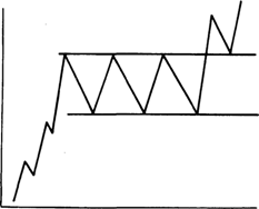 a trader's toolbox.
You've probably heard that graphical analysis is based on the behavior patterns of the crowd, which, while becoming smarter year after year, remains true to its core instincts and thirst for profit.
Therefore, when using graphical analysis patterns, you always rely on crowd analysis, and if you understand where the majority of players are likely to move the market, you'll always remain profitable, despite losing trades.
The Rectangle pattern is considered a classic trend continuation pattern in Forex. Every trader is plagued by doubts about whether to close a position, as the trend may end or, conversely, be added to by a new order due to the continuation of the current trend.
In fact, knowing about a possible trend continuation and its future direction will always help you protect your pocket, and not just preserve it, but increase it.
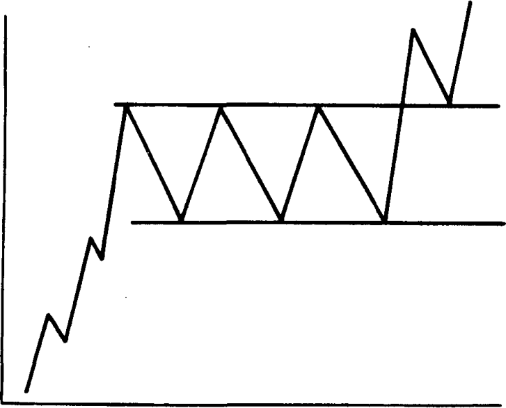
The rectangle pattern is 90% similar to a trend continuation pattern called a Flag, which, by the way, you should also read about in the article "Trend Continuation Patterns." It forms after a strong price move, after which the price chart begins to move horizontally, or more simply, sideways.
Next, two horizontal support and resistance lines for this pullback. The lines should be parallel to each other, which is why the pattern is called a rectangle. You can see an example of a rectangle pattern in the image below:
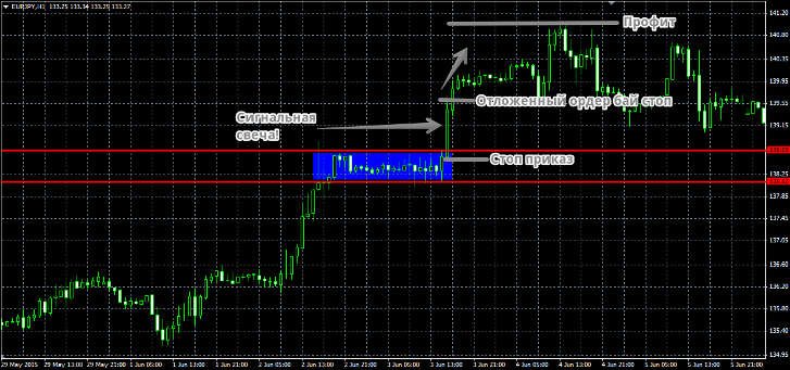
There are various approaches to trading this pattern, but we'll start with the classic approach and a couple of modifications. The classic approach states that this pattern is a trend continuation pattern, so if a rectangle forms during a bullish trend, a breakout of the upper resistance line is a signal to enter a buy position.
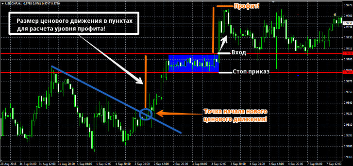
A stop order is placed at the nearest local low or, as is often the case, at the rectangle's support line. The potential target is calculated in a unique way: by finding the point in history where the previous movement ended and the current one began.
Next, the distance in points from this point to the upper border of the rectangle is measured. This distance in points is ultimately our profit. Many people wonder how to find the point where the price changes direction. It
's very simple: draw a trend line along the past price movement, and the point where it breaks is the profit starting point. The instructions may be a bit unclear, so I recommend looking at the example in the image below:
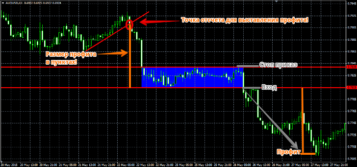
A rectangle also appears during a bearish trend, so if this pattern forms in front of you, the signal to enter a sell position is a breakout of the rectangle's lower resistance line.
A stop order is placed near the support level or the nearest price high. The profit is set at the size specified in the buy conditions. An example entry can be seen in the image below:
Now, I'll introduce you to some modifications that deviate from the classic approach. The first and most common is to enter a position not on a breakout, but by placing a pending order at the high of the candle that breaks the rectangle level in the direction of the trend.
A stop order is placed just below the low of the candle (or, in a bearish market, the high). The profit is set at twice the stop order. To better understand the modification, I recommend looking at the example in the image below:
The advantage of this approach is that you protect yourself from a false breakout of the rectangle, but the price for such protection is the loss of the lion's share of profits. A more radical approach to this pattern is to convert it from a trend continuation pattern to a reversal pattern.
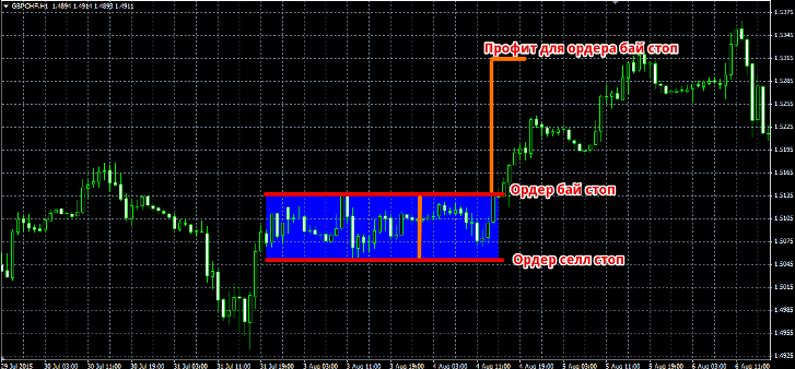
Many traders, seeing a rectangle pattern, claim that this is a moment of accumulation of strength, so they enter whichever of the square's boundaries the price breaks in that direction. To do this, place a buy stop order at the upper level of the pattern, and a sell stop order at the lower level.
The stop order is the width of the rectangle, and the profit is set to the width of three identical rectangles. When one of the pending orders is triggered, the opposite one is deleted. An example is shown in the image below:
The advantage of this approach to using the rectangle pattern is that the trader captures the movement no matter which direction it goes.
However, the disadvantage is that by using this approach, you undermine the general approach to this pattern, which typically signals a trend continuation, not the opposite. Therefore, the price may trigger your counter-trend pending order and return to the rectangle, as if by the book.
In conclusion, I would like to say that all three methods of using the square pattern have their place, but, as a rule, the classic approach works best, and the risk-to-reward ratio of the first option is clearly superior to the other two.