Pivot points

Many traders perceive these tips as the purely personal opinions of experts who base their calculations solely on their own strategy.
However, almost all of these analysts use fairly simple formulas to calculate turning points, and most of their forecasts are similar.
Are you conducting technical analysis on Forex and don't know how to calculate turning points?
After reading this article, you'll never have to worry about finding these levels.
Calculating five-level pivot points
The best channel indicator, comparison, review and basic settings
Price, as trivial as it may sound, follows certain patterns in its movement.
It's no secret that the wave theory, like many others, is based on observations, but one of the most fundamental patterns is the channel-like movement of the price.
You might ask, how does this pattern manifest itself? I think it's no secret that the price almost never moves exclusively up or down.
No matter which chart you open, you'll always see various pullbacks and undulating graphs. This is because, according to many theories, the price always seeks equilibrium after strong fluctuations in different directions.
It is during these fluctuations that the channels that are so often used in technical analysis are formed.
Fibonacci levels, practical points.
Fibonacci retracements are one of the most widely used technical analysis tools for  predicting price corrections. Dozens of books have written about Fibonacci retracements, and the world-renowned wave theory relies on them in one way or another.
However, despite the popularity of the instrument, opinions about it are quite contradictory.
This is connected with the very theory of the instrument's creation, since modern economists and mathematicians simply cannot explain the patterns of movement in financial markets, and the theory of the "Golden Ratio," which is so applicable to both living and non-living nature, is at first glance incompatible with financial markets.
Bollinger Bands
Bollinger Bands are a technical analysis tool, or more precisely, an indicator consisting of three lines that form 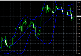 a channel and show price deviations. The world first learned about Bollinger Bands thanks to the publication of the famous book "Bollinger on Bollinger Bands" by John Bollinger.
In the book, the author describes in detail how to use his tool, provides statistical information, and offers interesting advice to investors that will help them avoid common mistakes.
Initially, the indicator was designed for trading stocks and futures on the stock exchange, but due to its high popularity and effectiveness, the bands also began to be used in the Forex market.
The well-known trading rule of "sell high and buy low" has proven difficult to apply in practice, as it's always difficult to determine the maximum and minimum points. John Bollinger attempted to solve this problem, therefore, the upper line should be taken as the market's minimum, and the upper line as the maximum.
Forex trend line
The trend line is one of the oldest and most effective tools of technical analysis, dating back to the first definition of a trend by Charles Dow.
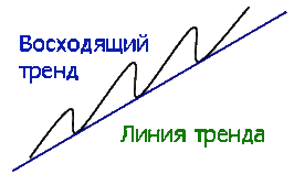
Before we move on to the trend lines themselves, I suggest recalling what a trend is and what types of it are identified by technical market analysis.
According to Dow, trends can be upward, downward, or horizontal. An upward trend is a succession of rising peaks, with each new peak and trough being higher than the previous one.
A downward trend is characterized by the gradual emergence of downward peaks, with each new peak forming below the previous one.
A horizontal trend, also known as a flat, is characterized by the fact that all new peaks and troughs are in the same vertical plane and practically at the same level.
Dow Theory for Forex Trading
Before you begin learning technical analysis, you need to study the history and principles on which it is based.
After all, if you begin to study such a broad area, a ton of questions arise that are connected precisely with the foundations and foundation on which it is built.
The world first learned about the Dow Theory thanks to the world-famous publication of the book "The ABCs of Stock Market Speculation," which was written by S. Nelson.
It was here that you first encountered the term "Dow Theory." The book's author based it on articles written by Charles Dow in the Wall Street Journal, where he shared his theoretical views on the stock market.
Gann's Tools
Gann is one of the most legendary traders in the history of trading. In a short period  of time, he amassed a fortune of $50 million, and you can always see his portrait when you enter the stock exchange floor.
In addition to his phenomenal success, Gann went down in history for making a significant contribution to the development of technical analysis, raising it to a new level and introducing new approaches to working with financial markets.
The most interesting thing is that Gann left us with a bunch of different tools that he still uses in technical market analysis, but, unfortunately, due to the difficulty of writing books about them, no one really understands which of the approaches actually helped him make such a fortune.
There is even an opinion among traders that Gann is not telling the whole story and has not revealed the main secrets of using his tools.
Forex figure is a rectangle.
Proper use of graphical analysis patterns is a major asset to 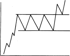 a trader's toolbox.
You've probably heard that graphical analysis is based on the behavior patterns of the crowd, which, while becoming smarter year after year, remains true to its core instincts and thirst for profit.
Therefore, when using graphical analysis patterns, you always rely on crowd analysis, and if you understand where the majority of players are likely to move the market, you'll always remain profitable, despite losing trades.
The Rectangle pattern is considered a classic trend continuation pattern in Forex. Every trader is plagued by doubts about whether to close a position, as the trend may end or, conversely, be added to by a new order due to the continuation of the current trend.
Graphical analysis on Forex.
When analyzing financial markets, price movement charts are widely used, and one way to study these  charts is through graphical analysis.
Graphical analysis is a component of technical analysis, a method of market study using graphical constructions that allow one to identify existing trends and more fully understand the picture that has developed over the analyzed time period.
The primary tools of graphical analysis are lines and the patterns they create.
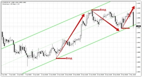
Trend continuation patterns
We often encounter a situation where the price begins to pull back from the main  trend with renewed vigor. At this point, you're faced with the age-old question: will the price continue in the new direction and end the trend, or will it return to the trend after a minor pullback?
Traders face this situation daily, and unfortunately, many make the mistake of entering a position hoping it's the beginning of a new trend or, conversely, hoping for a pullback and holding on until profits are completely wiped out.
Today, I'd like to introduce you to two of the most common trend continuation patterns, which will help you predict the future development of a trend with a high degree of certainty.
Almost all traders are familiar with various trend reversal patterns, as the long-held dream of entering at the bottom always haunts traders. However, only true pros know that reversals aren't worth chasing; they should instead seek out strong trends and entry opportunities along them.
The best indicators for Forex.
There are now a plethora of different indicators for Forex trading, with thousands of scripts available.  It's quite difficult to single out the best options from this plethora.
When trading with various strategies, I've often had to use indicators, and over the course of my work, I've developed my favorites.
The best Forex indicators typically combine a number of qualities: they fully meet the objectives for which they were written, have simple setup, and generate a minimum number of false signals.
The following scripts can be classified as such:
Head and Shoulders Figure
The head and shoulders pattern is the most common reversal pattern in graphical 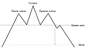 analysis.
Every newcomer to the forex market eventually stumbles upon training on graphical patterns, whether in seminars, books, or simply videos. The basics begin with graphical analysis.
The problem is that many traders use patterns without understanding their origins, much less considering the underlying facts. These patterns emerged from traders' observations, specifically from price movement patterns.
Sperandeo's method
Many critics of technical analysis always argue that the construction of certain figures and lines 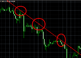 depends on the trader's subjective opinion. This type of analysis has no clear rules, and while one trader sees support in one place, another might draw it in a completely different spot.
When it comes to constructing trend lines, the situation is even more bleak.
According to the rules, at least two extremes are required to construct a trend line. But here's the catch: everyone chooses this extreme for themselves and attaches importance to it, which leads to the line being constructed incorrectly, and its signals are either false, or you simply miss a real reversal and enter the market too late.
Double Bottom Figure
The double bottom pattern is a reversal pattern most commonly seen in the forex market. It 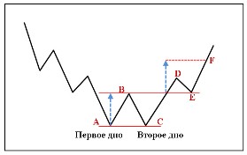 forms in a bearish market when a trend begins to run its course.
All traders know about this pattern, as it's described in books on graphical analysis as the very first of the reversal patterns. Because it's so familiar, the crowd typically acts according to the textbook, so in real trading conditions, it often works.
You encounter it quite often in real life, because unlike the Head and Shoulders reversal pattern, major players don't have to put in as much effort to reverse the trend as they do with the aforementioned pattern.
Fibonacci Fan
All trading applications have a number of tools that are essential for analysis. This group is called "Fibonacci Tools". 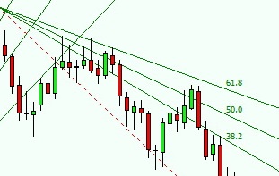 These tools help to design a price map with high accuracy. Among such tools are:
• Fibonacci levels;
• Fibonacci extensions;
• Fibonacci fan;
• Fibonacci channels.
•
These graphical models require correct construction, otherwise their readings will be incorrect and, accordingly, ineffective.
The Fibonacci fan is based on the Fibonacci grid - these are three lines at levels equal to 38.2, 50, 61.8 percent. All lines have a common point, creating a grid of support and resistance lines. On the chart, these lines look like a fan.
The Wedge figure
Using graphical analysis in the Forex market is no less effective in predicting price fluctuations than 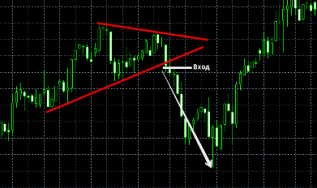 using various indicators or fundamental analysis.
The entire analysis is based on constructing various chart patterns that can indicate a possible continuation or reversal of a trend. Where did these patterns come from, and why are they so widely used?
Graphic analysis was one of the earliest to emerge, so over the course of several decades, traders have noted a number of patterns, which have evolved into teaching aids in the form of various patterns.
The "Wedge" pattern is a reversal pattern in graphical analysis that typically appears at the peak of a trend's end and signals a possible price reversal. There are two types of wedge: bearish and bullish. Each appears in the trends for which they are named.
Page 2 of 4